

Now that the Slow Lane report has been reported to the public, let's take a look into the methodology, substance, and component messaging of this report. In this post, we will examine the main body of the report slide by slide. A complete copy of the report with appendices is available here:
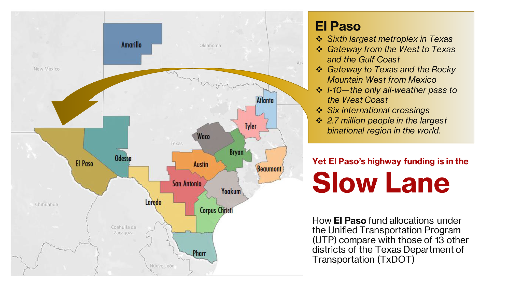
This presentation begins by introducing a contrast between El Paso’s trade and economic attributes on the one hand, and state transportation funding on the other. We concentrate on funding from TxDOT fund Categories 2, 4, and 12, and we compare these among the 14 districts of the Texas Department of Transportation shown on this map.
Note the size and location of the El Paso district of TxDOT. It comprises the six westernmost counties in the state, including El Paso. We settled on a district-level analysis due to how funds are deployed and the availability of data. The subject is the district, not the city, the county, or the Borderplex region. However, all of these areas benefit from the transportation investments in this district.
This comparison on the basis of fund allocations makes a case for rebalancing investment in El Paso’s favor. Our presentation shows by how much El Paso falls short.
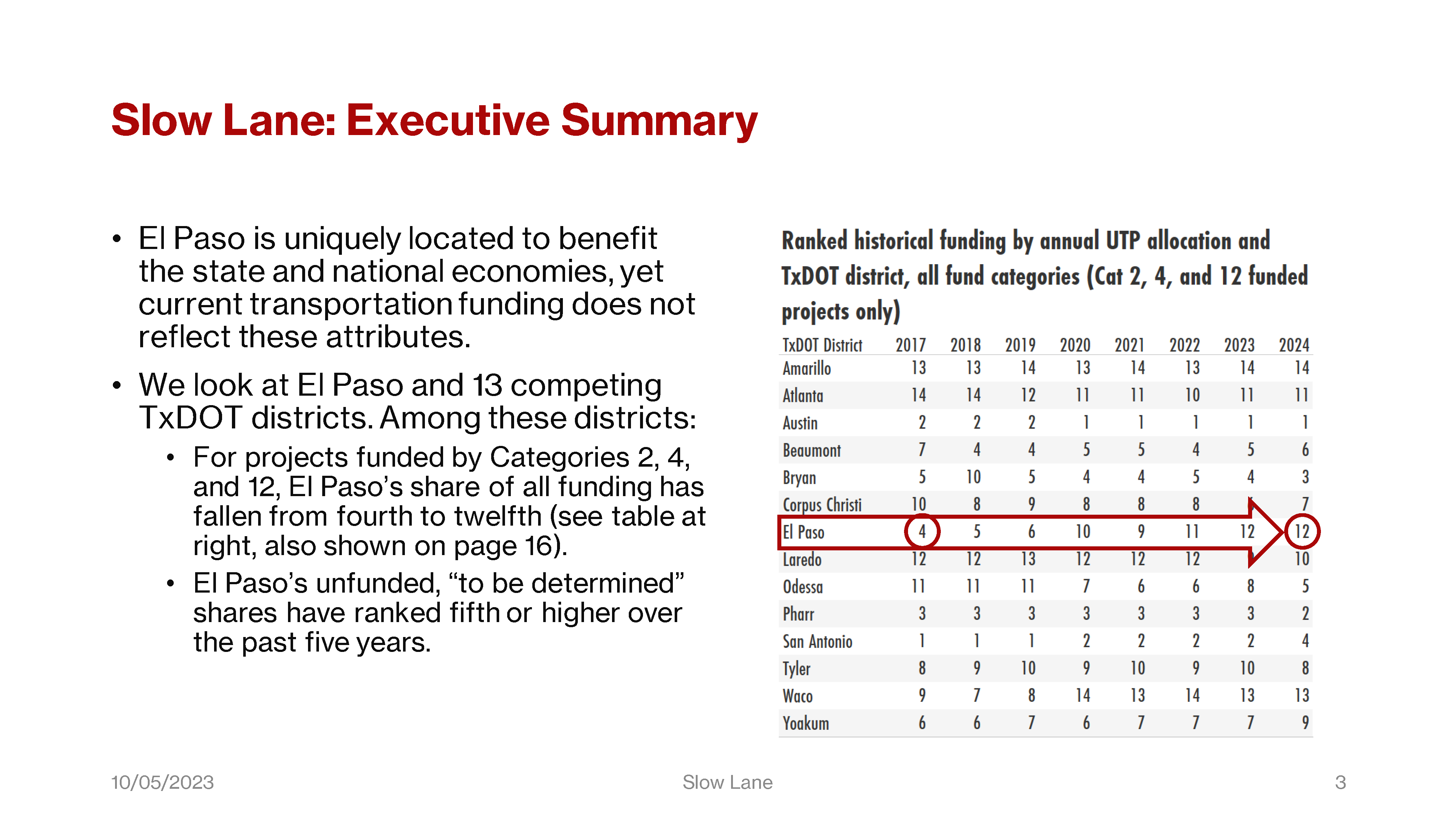
So, given El Paso’s comparatively strong case on locational merits, like economics and international trade, are we receiving less funding than districts with less merit on this case?
The answer to that question is yes. The source for the charts in this presentation is a worksheet with 2,640 UTP projects from FY2017 through FY2024 — every project that received any funds from Categories 2, 4, or 12. That includes any among these projects that were or are to receive funds from other categories. When these allocations are added up, El Paso district’s rank for fund allocations among the 14 districts has fallen from fourth to twelfth (as you see here).
We also consistently rank in the top five for the “to be determined” shares of project funds, and we were first among those in fiscal years 2021 and 2022.
That’s the birds-eye view across these districts. There is more going on internally regarding the allocations across fund categories.
Only three of the 14 districts still rely on Category 2 for a third or more of their funds. Those are El Paso, Waco, and San Antonio; and just this year for San Antonio, whose Cat 2 shares of all funds popped up from about a quarter in the previous two fiscal years.
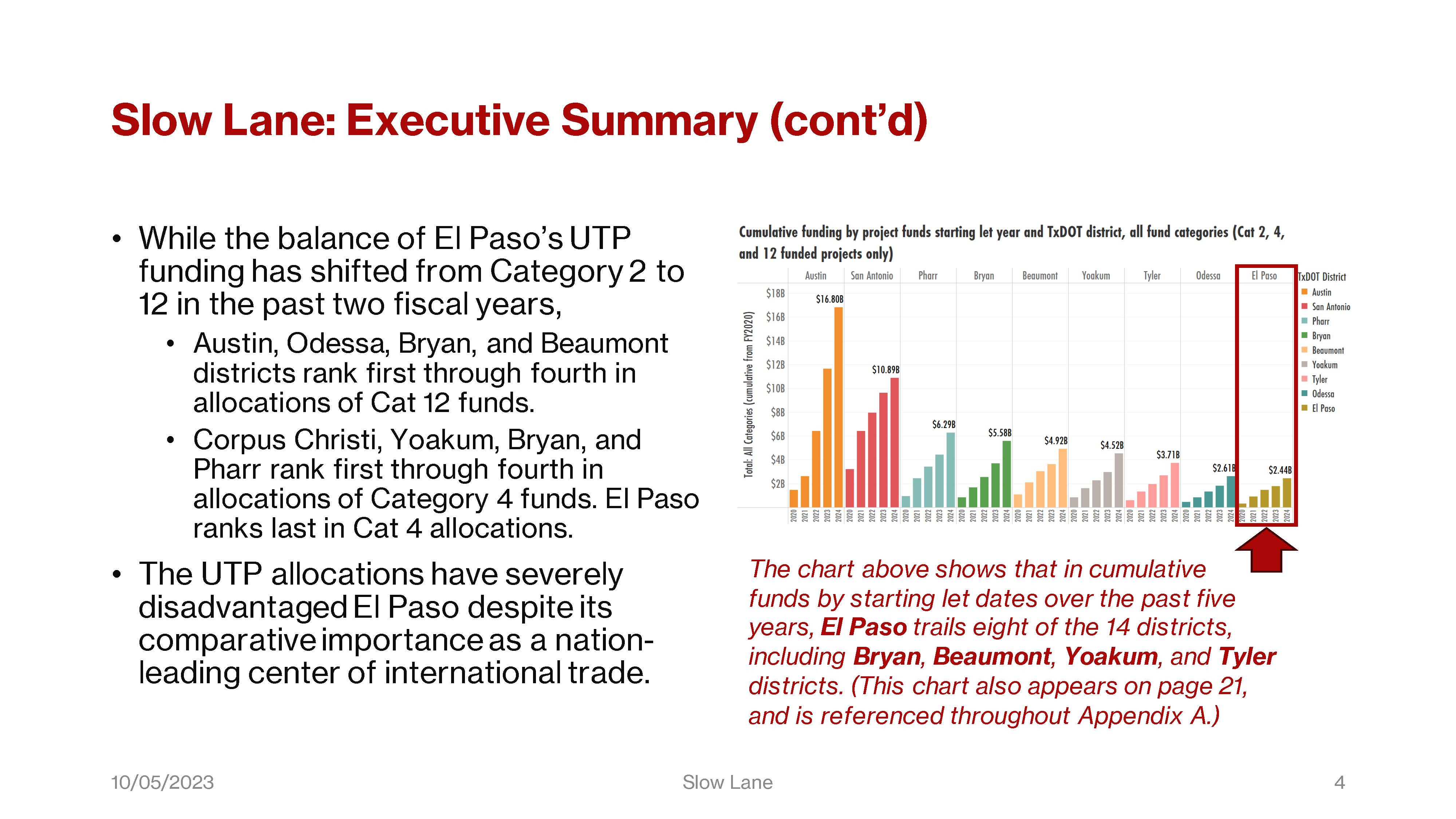
The remaining eleven districts rely more on Categories 4 and 12.
Those relying on Cat 4 include districts like Bryan and Yoakum, that are smaller than El Paso. But as you can see — and what’s charted here are the cumulative project funds as of their starting let dates, when those funds are deployed, — those smaller districts are better funded than El Paso.
The locational merit case for El Paso, based on international trade, economics, population, our proximity to Ciudad Juarez, etc., is wholly presented on this one slide.
These bullets may not comprise a compelling argument against San Antonio or Austin. However, they do weigh against districts like Beaumont, Bryan, Tyler, and Yoakum.
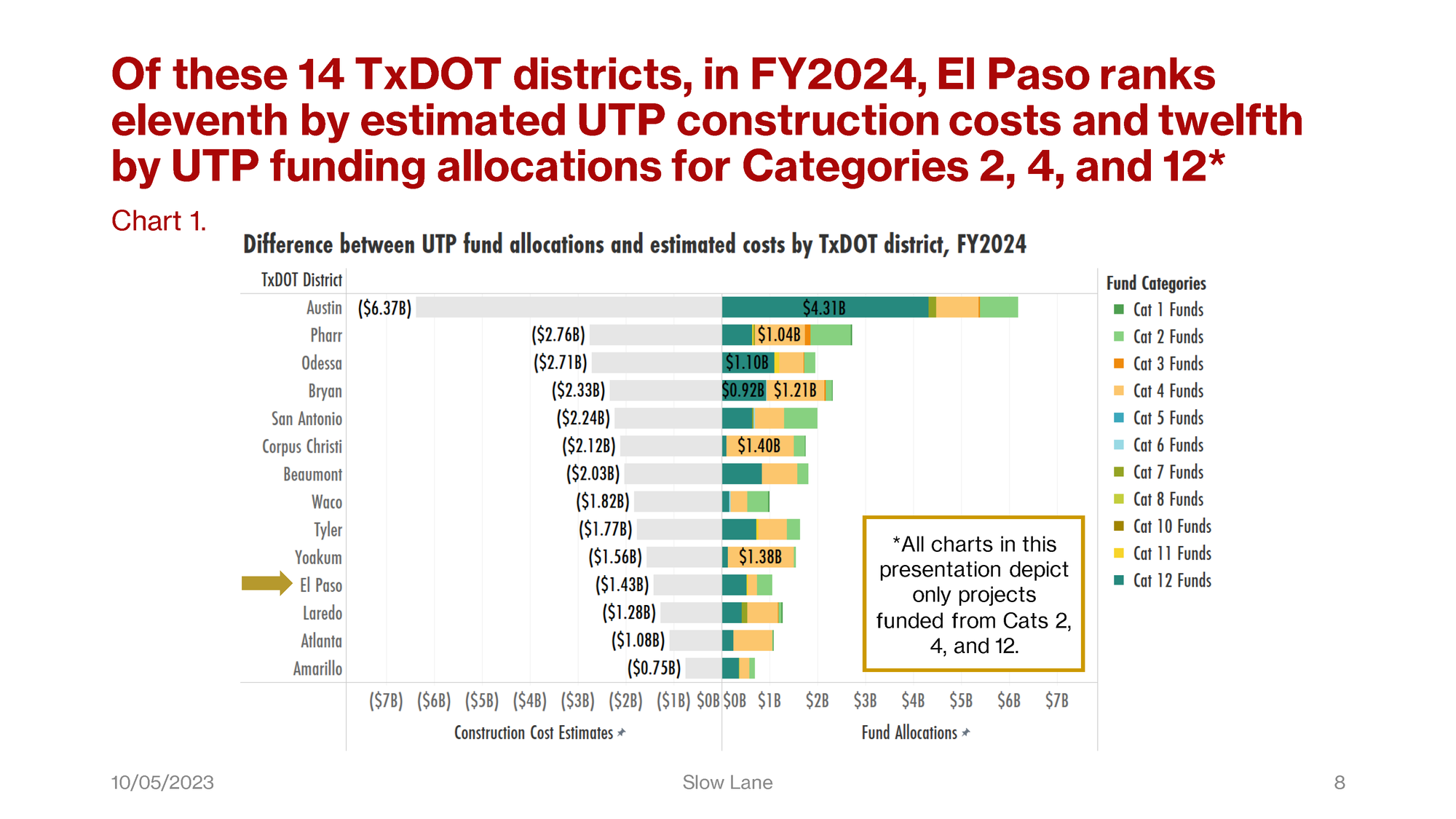
Charts 1 and 2 are biaxial stack-bar charts of FY2024 UTP project costs and funding. On the left are cost estimates, and on the right, fund allocations for all categories to each district and for all projects that are funded by Categories 2, 4, and 12. So as you can see, there are projects funded by Cats 2, 4, and 12 that receive funds from other categories as well.
Chart 1 is sorted by cost estimates, and so as indicated in the headline, El Paso ranks eleventh by that measure.
This chart allows us to see how the total allocations by category compare against their corresponding project costs, district by district. We’ll get a closer look at the comparative funding breakouts in a moment on Chart 3.
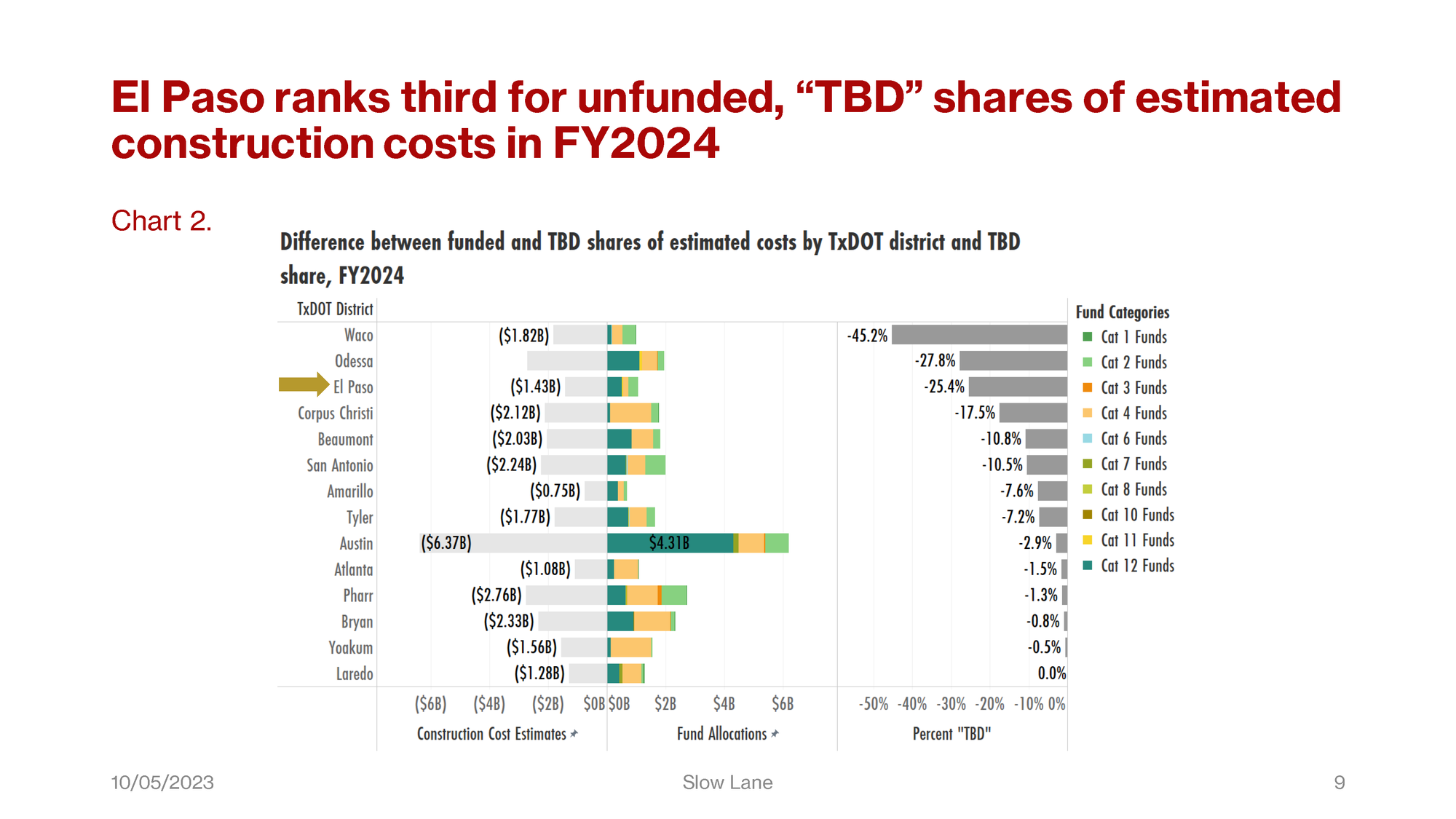
Chart 2 shows the same data summarized in Chart 1, but this chart is sorted by costs “to be determined.” For each district, these comprise the remainder of project cost estimates after subtracting the shares funded by all categories.
The Excel spreadsheets posted by TxDOT don’t accurately show these figures, because they don’t include Categories other than 2, 4, and 12. However, the TxDOT PDF-formatted UTP reports do include the allocations from those other categories.
El Paso ranks third for these unfunded shares in FY2024, and first in these missing funds for fiscal years 2021 and 2022.
Charts 1 and 2 are for the FY2024 UTP only. The entire series of UTP allocations to all districts from FY2017 through FY2023, are published in Appendix B (in the complete copy available for download at the top of this article).
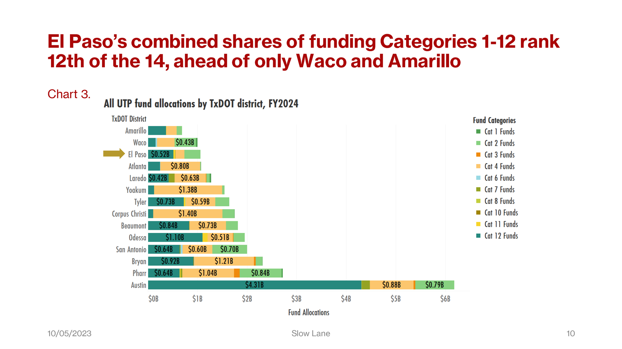
Chart 3 shows the same data as the X-axis on the right of Chart 1, and at the center of Chart 2. This chart is sorted by the total allocations from all fund categories, so it allows better comparisons among those allocations.
El Paso district ranks twelfth among these 14, as the title says. You can see how much of Category 12 is drawn by Austin. You can also see comparatively how much of Category 4 is going to Atlanta, Yoakum, and Corpus Christi districts. Those are the first, third, and fifth bars respectively below that of El Paso.
In this main body of the report, the remaining charts and graphs will show fund categories across districts, then funds by counties, then show trends in UTP allocations over time.
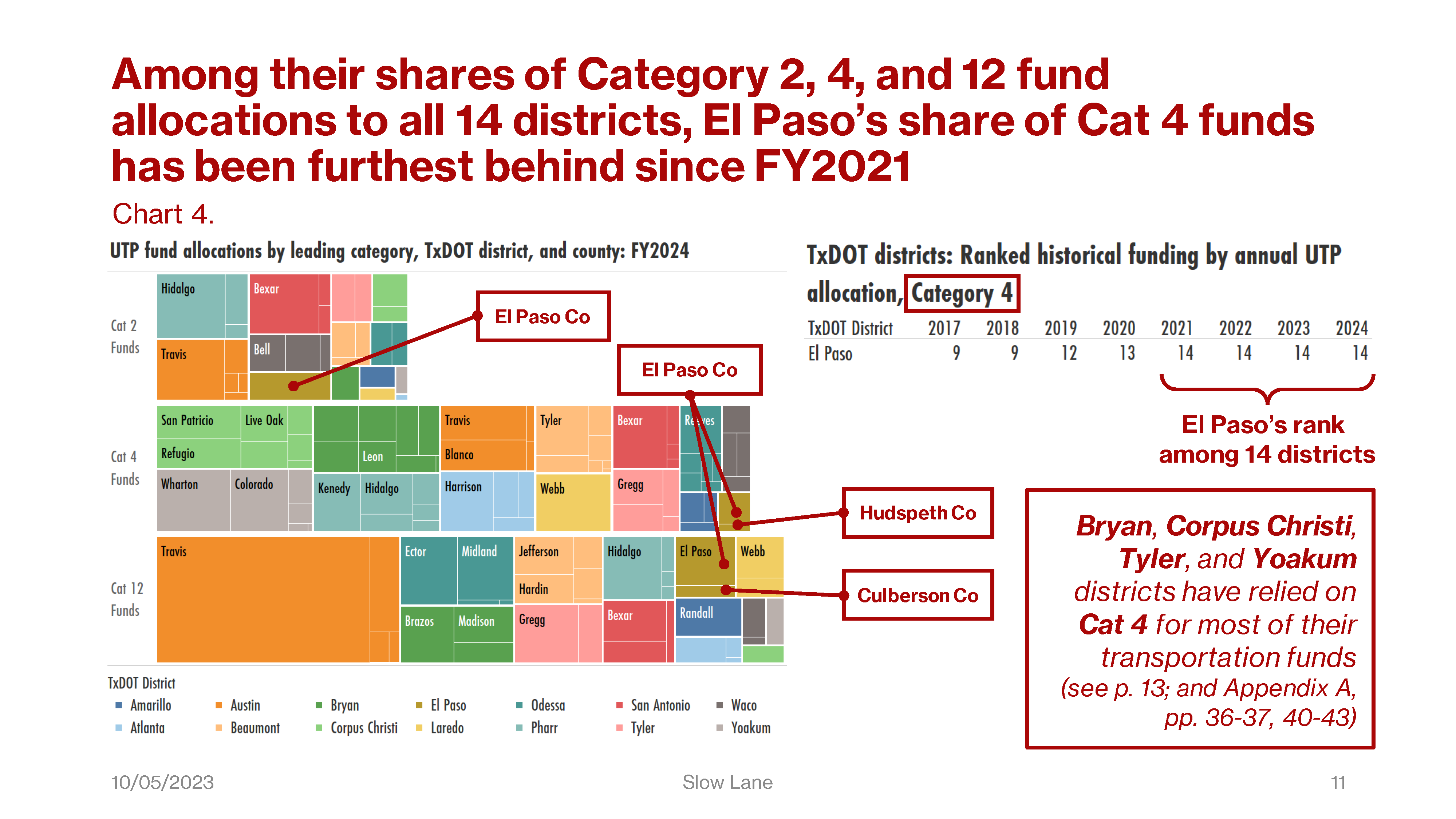
In Chart 4 on the left, we have a tree chart of three bars, one each for Categories 2, 4, and 12. On the right, we have an inset table snipped from a larger table that ranks districts by Category 4 allocations. Let’s first look at the tree chart.
Note the legend at the bottom with one color for each TxDOT district. Each of the three bars is segmented into counties within a district. Each county is colored according to the district to which it belongs. We’ll see this in more charts later, the colors are always the same. The order is also important. Greater amounts of funding are at left, smaller allocations to the right. The El Paso counties are indicated by callouts, and you can see how they compare by their sizes and positions. The inset table shows that for Cat 4, El Paso district has ranked last every year since FY2021.
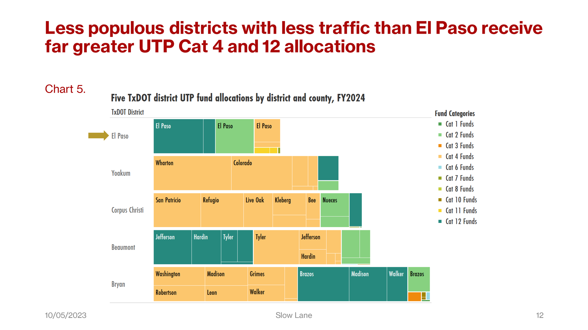
Chart 5 is also a tree chart: this one to compare the composition of funds by category to counties in El Paso, and among districts that compete with El Paso.
The unmarked counties are not labeled, but the other counties in the El Paso district other than El Paso include both Hudspeth and Culberson. These are marked in the bubble charts you will see later.
Just as in the stack-bar charts we saw earlier, the light green blocks are Cat 2, the mango-colored blocks are Cat 4, and the dark green blocks are Cat 12.
You can see the importance of Cat 4 to these other districts: Yoakum, Corpus Christi, Beaumont, and Bryan. As a reminder, these are Statewide Connectivity Corridor Projects. Corridors are selected by the Commission, and Districts select projects along corridors in consultation with MPOs, the Transportation Planning and Programming Division and TxDOT Administration.
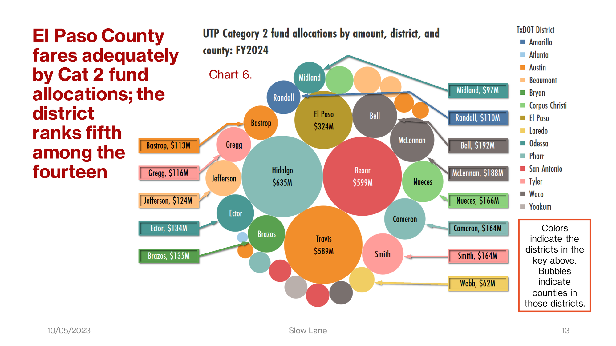
Charts 6, 7, and 8 show county data similar to Chart 5, but each of these charts shows allocations to counties from a single fund category, and to all 14 districts. Chart 6 here is for Category 2 funds in FY2024.
Again, color, size, and order are all important. Each bubble is a county colored to match its parent district. Larger bubbles show greater allocations, and are at the center of the chart. Smaller allocations appear at the edges of the chart. We wanted to indicate what the actual allocations were to the smaller named counties, so we’ve added these callouts.
In Chart 6, even though El Paso County shows one of the larger allocations, that allocation isn’t enough to meet the County’s needs. This Category 2 allocation is not sufficient to cover the planned improvements to I-10 in Downtown El Paso. Eduardo Calvo, executive director of the El Paso Metropolitan Planning Organization, is quoted in the El Paso Matters article as estimating the cost of this single project "between $800 million and $900 million." Yet these $314 million dollars in Cat 2 allocations comprise more than 30 percent of all UTP allocations to the entire El Paso district in the FY2024 plan. The remaining allocations don’t make up the difference.
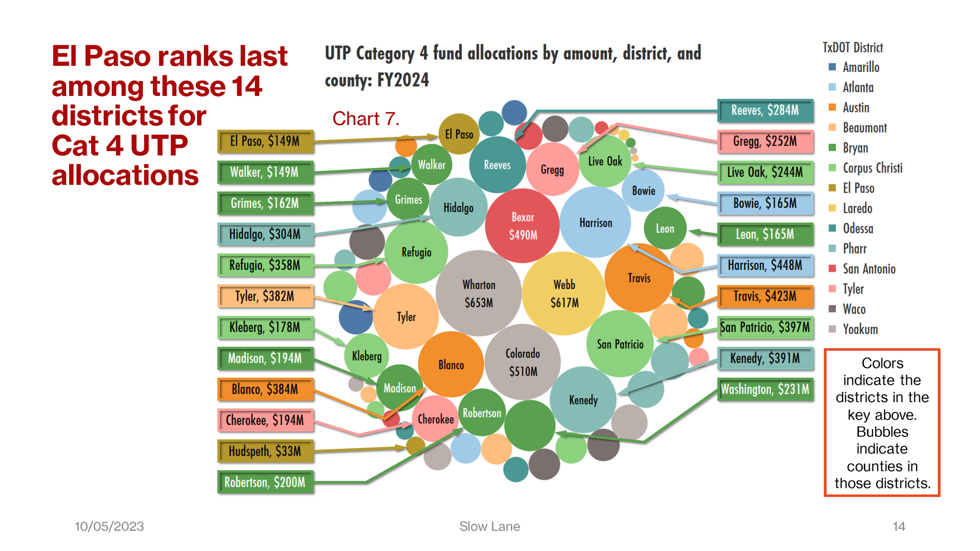
Chart 7 maps Category 4 allocations across all 14 districts in FY2024.
On this chart, there isn’t much for El Paso, up at the top left, and for Hudspeth County, at bottom left.
Yet look at the grays, greens, and blues. Two of the three largest bubbles, the gray ones at the center, are for Wharton and Colorado Counties in Yoakum District. Yoakum and Pharr districts are the two where TxDOT is developing the I-69 corridor to link the Rio Grande Valley with Houston, as mentioned by Eduardo Calvo in the El Paso Matters article covering this report.
The light green and dark green, respectively, are Corpus Christi and Bryan districts, each with seven counties on the chart.
The light blue is Atlanta district, another small district in this survey. Atlanta has four counties on this chart, including Harrison County with $448 million
The light teal colored counties are in Pharr district. We see comparatively fewer, but still large appropriations here to Austin and San Antonio.
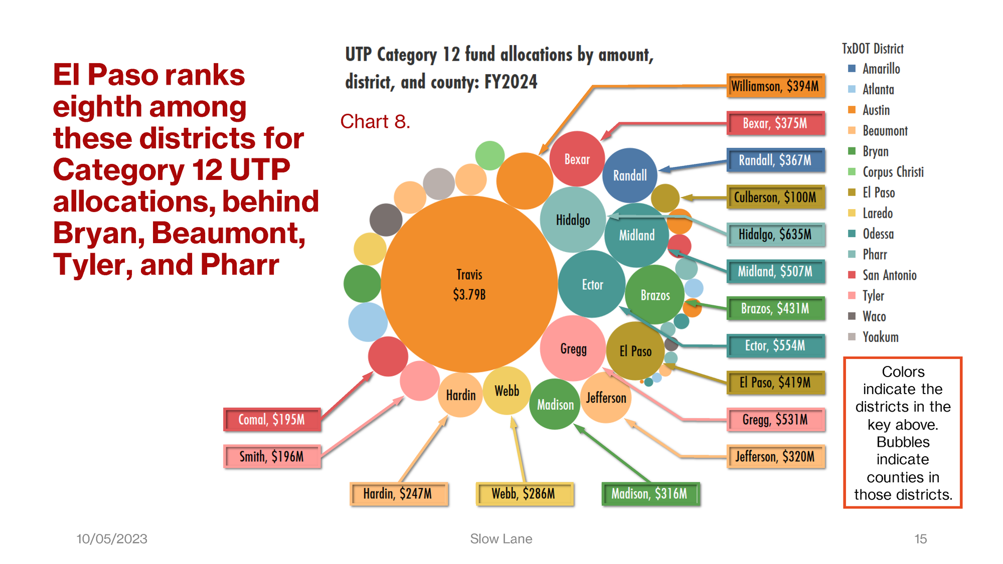
Even more so in Chart 8, which presents Category 12 allocations. As you can see, these are dominated by the allocations to Travis County in Austin district. There are Cat 12 allocations to four other counties in Austin district. The allocation to Williamson County is $394 million, just $20 million less than El Paso County’s allocation from Cat 12.
You’ll note a smaller allocation to Culberson County in El Paso district. But as the headline reports, El Paso receives fewer of these allocations than each of the districts of Bryan (dark green), Beaumont (peach), Tyler (pink), and Pharr (light teal).
Four counties in Odessa district will also draw Cat 12 funds, of course including Ector and Midland Counties.
Appendix A contains more detail about the trends by district in these three Categories of funds.
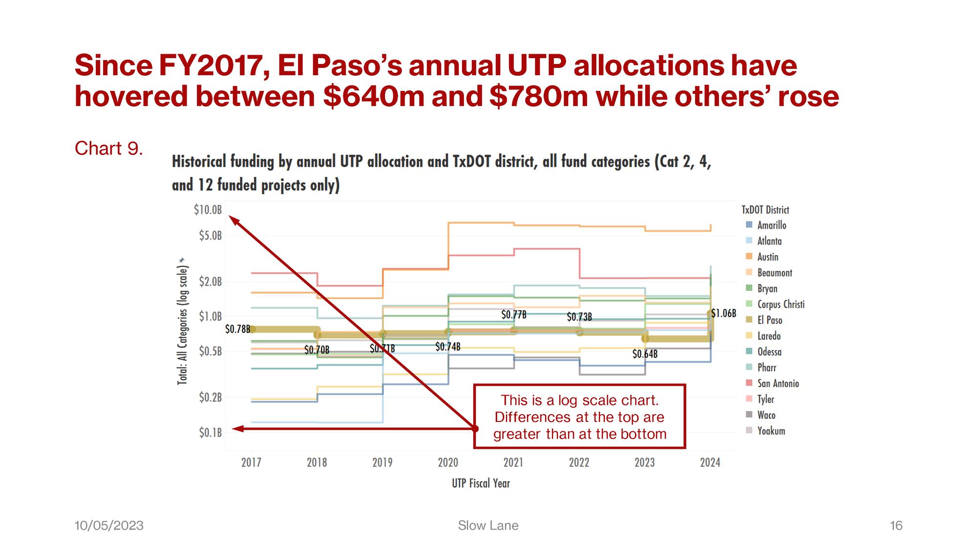
The remaining charts and tables in this presentation illustrate trends and rank order of the districts over time. Charts 9, 11, and 13 are step-line charts. We use these because once the allocations are concluded, they don’t change until the next iteration of the UTP.
Due to the wide variation in allocations between Austin and the less populous districts, we use a log scale on the Y-axes of Charts 9 and 11. That means that differences at the top of these charts are much greater than differences at the bottom. Using a normal scale would render the chart impossible to read.
Chart 9 depicts the trend in UTP allocations. What you can see is that allocations to El Paso have remained reasonably steady without rising, while those to most other districts all trend higher from left to right. And of course, the increases to Austin and San Antonio are much greater than they appear.
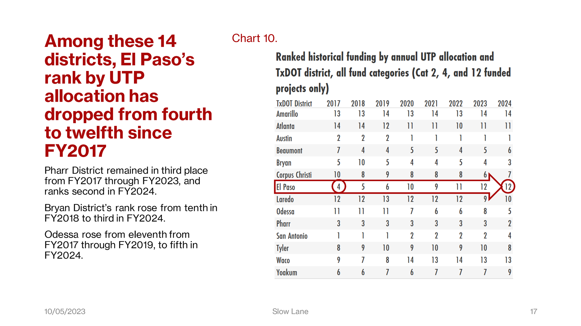
That is the reason why, as seen here in Chart 10, El Paso’s rank by UTP allocation has declined relative to all but a couple of these districts. This is the same table that appears on the first page of the executive summary.
Note also that even San Antonio has slipped from second to fourth place in FY2024. Pharr and Bryan districts are now ranked second and third. Odessa district ranks fifth, up from eleventh from FY2017 through FY2019. That’s the district with the greatest gain.
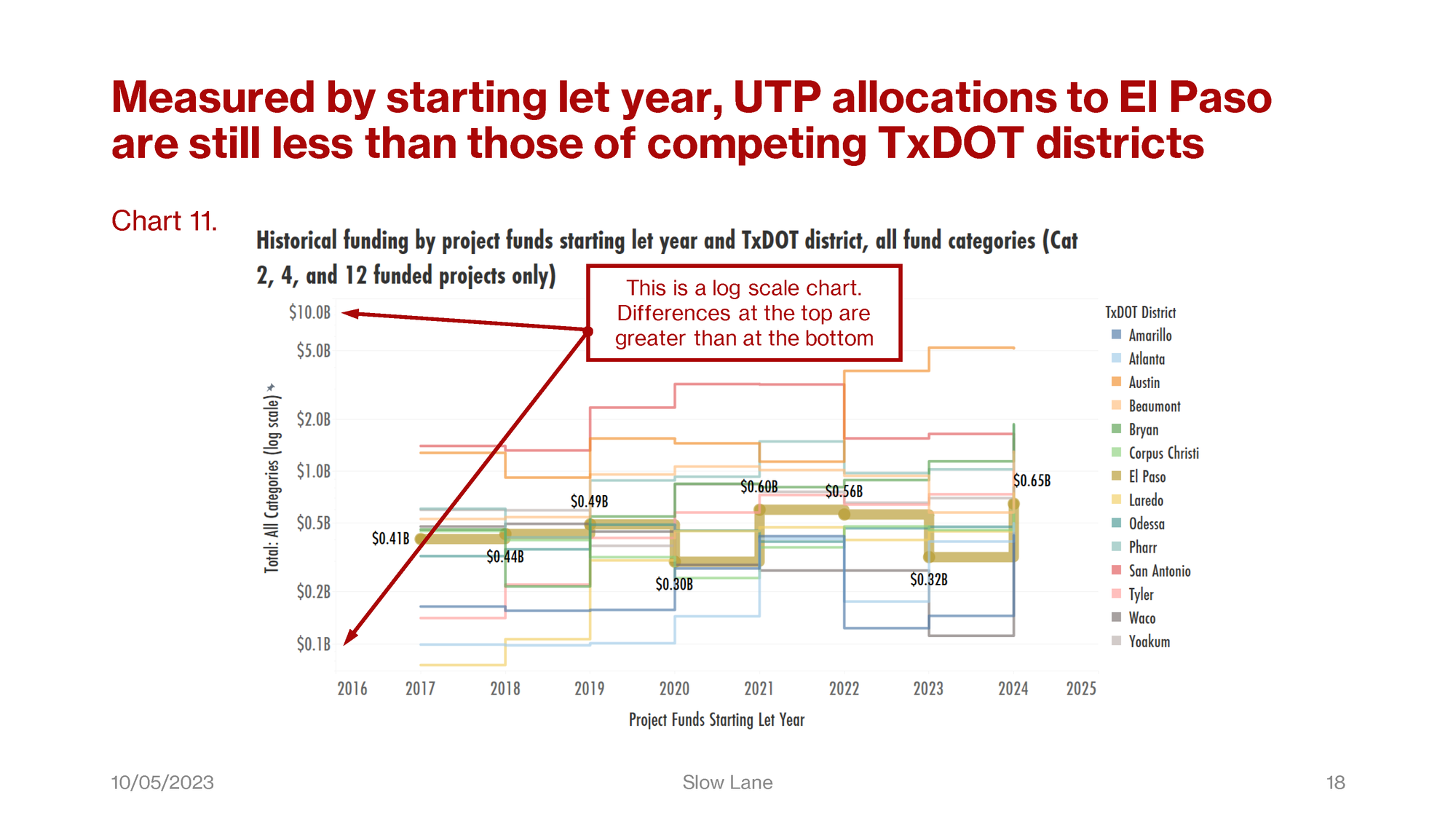
Chart 11 is another step-line chart. For this one, we use a different measure of fund allocations. In the charts you’ve seen so far, we’ve reported the allocations from the relevant UTP in the year that it was published. In this chart, and about half the charts in Appendix A, we wanted to view those funds in the year when they were actually available.
We therefore parsed the first and last year from the project let dates for each project. Then, we fixed the allocation amount at the fiscal year for the relevant project that coincided with the first year the project funds were let. By fixing those at the first year only, we ensured that project funds scheduled in sequential iterations of the UTP aren’t double-counted. The scale here is the same as in Chart 9, but in Chart 10 you can see that the pipeline of project funds has not benefited El Paso relative to other districts.
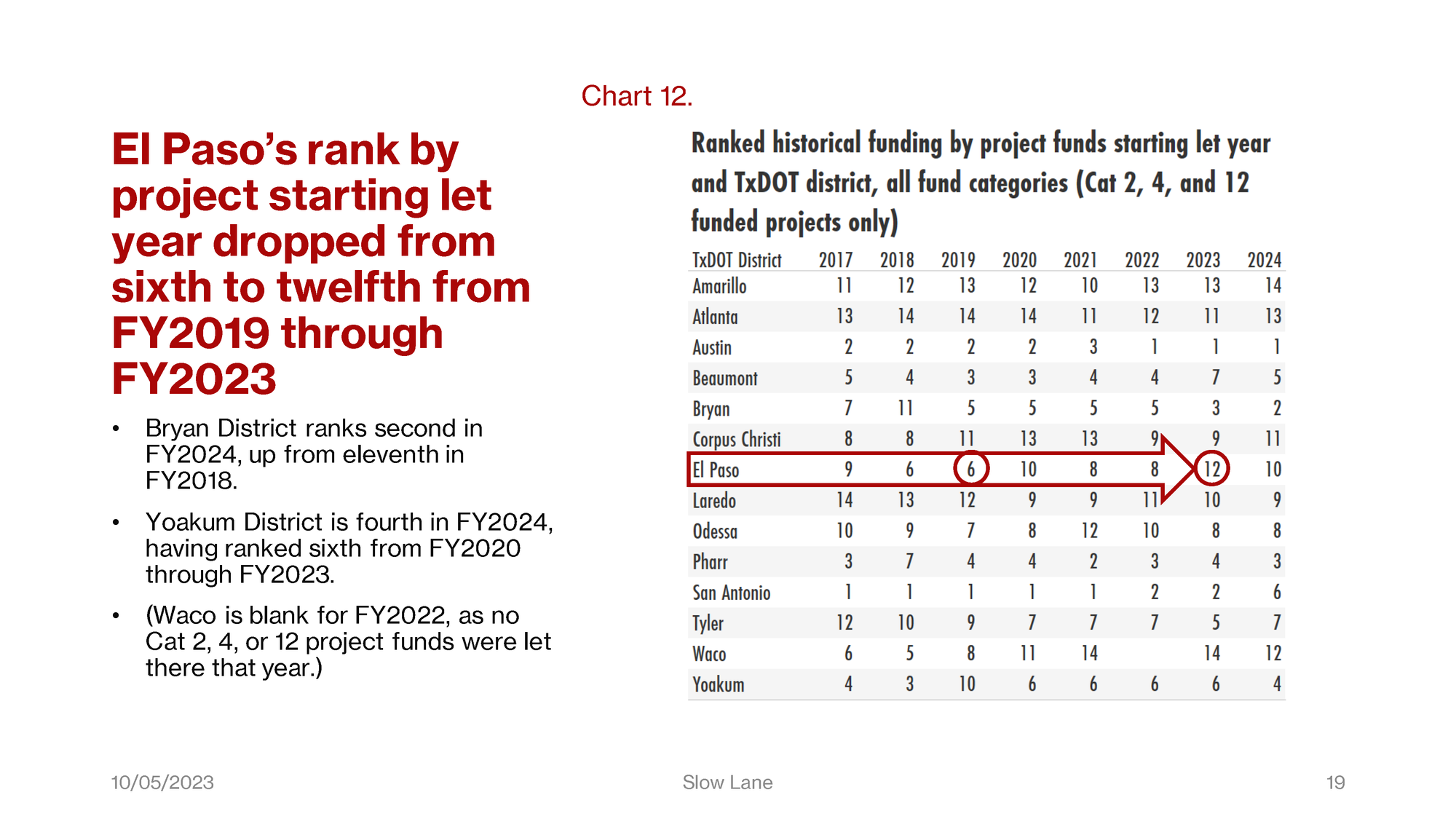
Chart 12 shows that comparing the districts in this way, El Paso sank to twelfth place a year earlier.
Bryan and Pharr districts are still in the top three. Yoakum and Beaumont districts have seen their project funds let more quickly, so they push San Antonio to sixth place. Tyler district ranks seventh in four of the past five fiscal years.
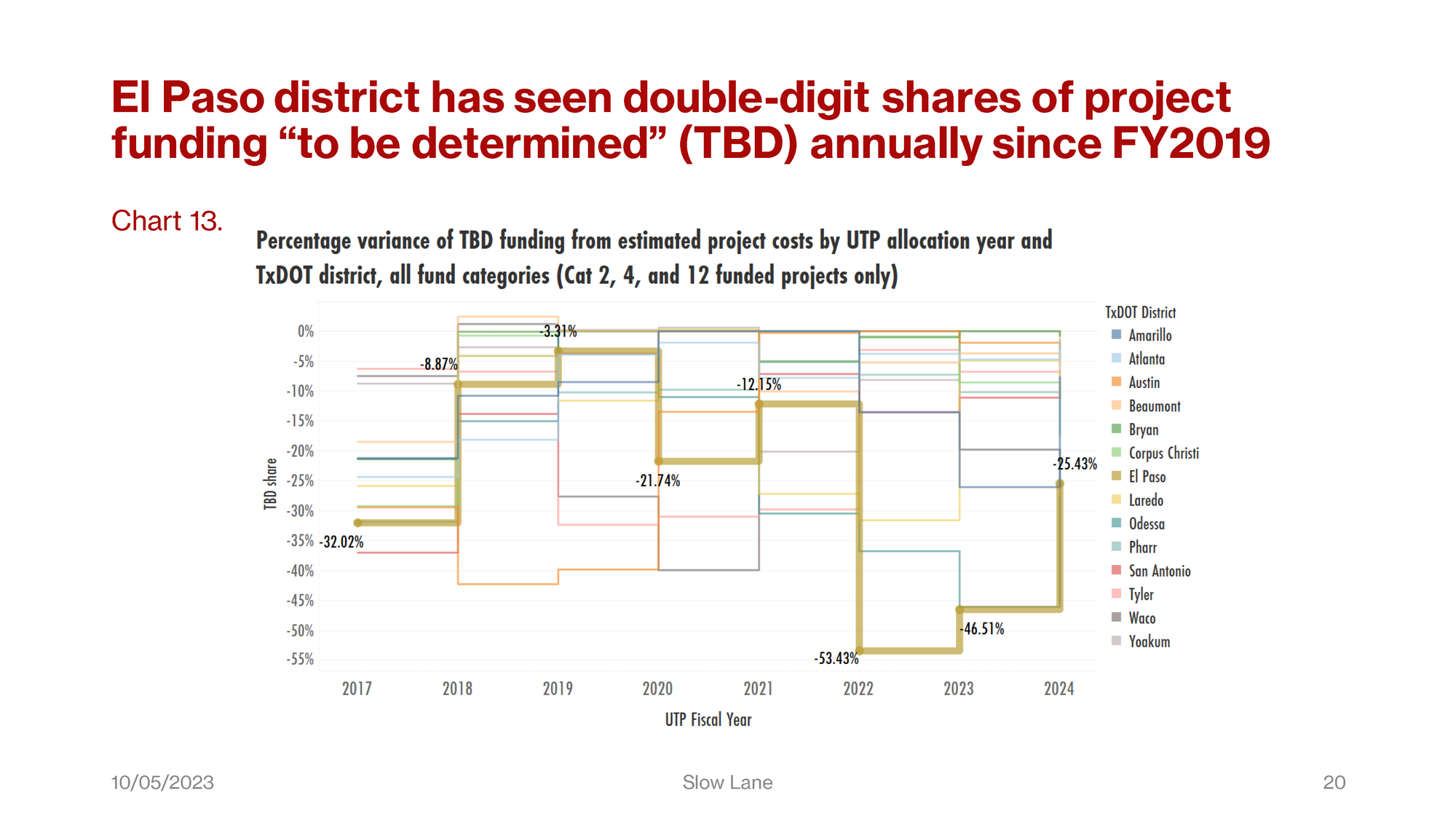
Chart 13 uses a percentage scale to map the shares of those missing project funds “to be determined.” The lower on the chart the line drops, the wider the gap between funding and estimated costs.
For El Paso, this gap was narrowest in FY2019. It was widest among all districts in FY2022 and FY2023, with TBD shares ranging from 46 to 53 percent of estimated project costs. That is to say, El Paso’s unfunded shares were about half of project costs,and highest among these districts in those years.
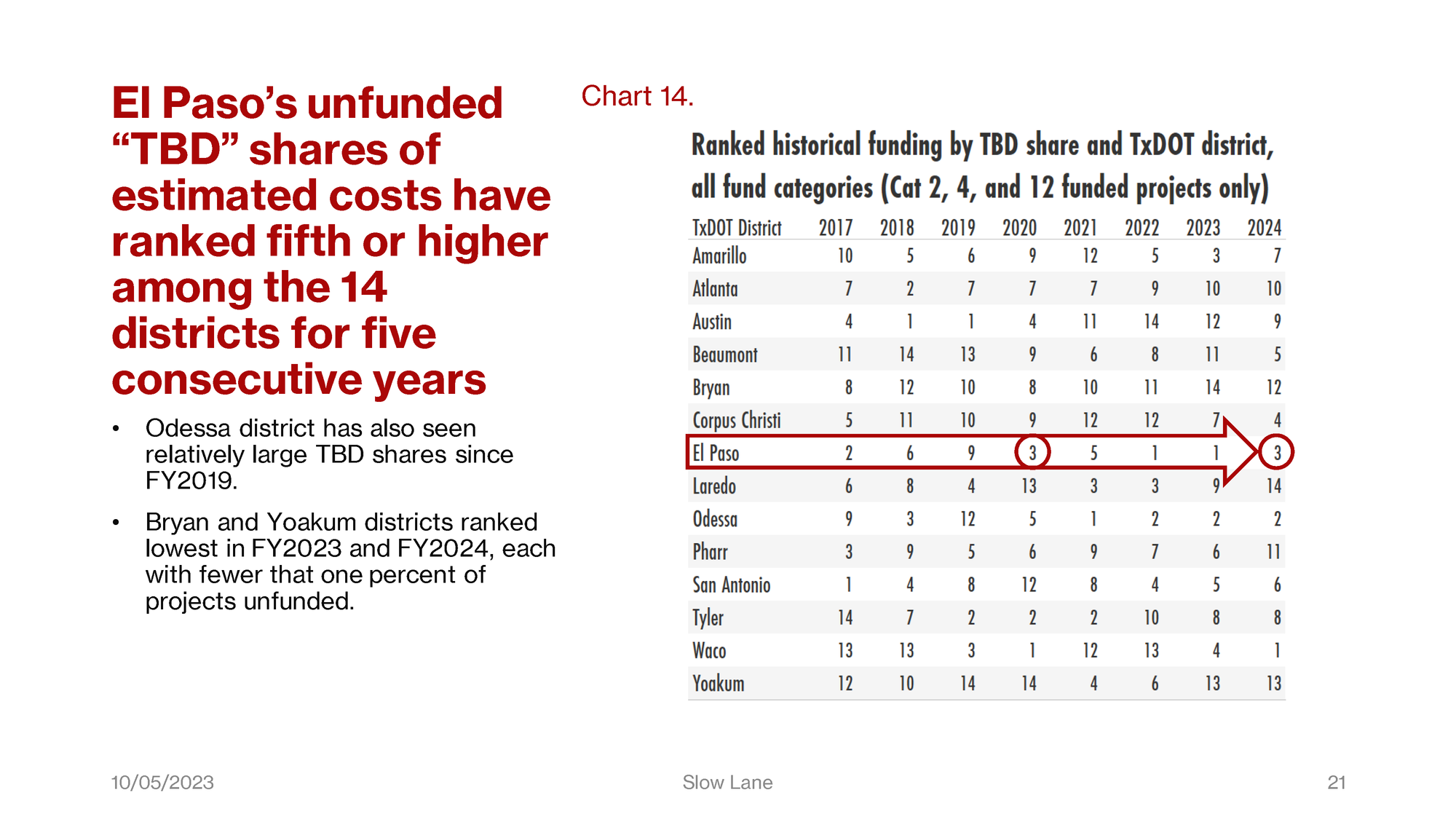
With its “to be determined” share down to about a quarter of project costs, El Paso now ranks third among the 14 districts on this metric.
Laredo district is fully funded in FY2024, so they rank fourteenth. Yoakum district has ranked thirteenth for two years. Bryan ranked fourteenth last year, twelfth this year. Both of these districts have TBD shares of less than one percent in FY2024.
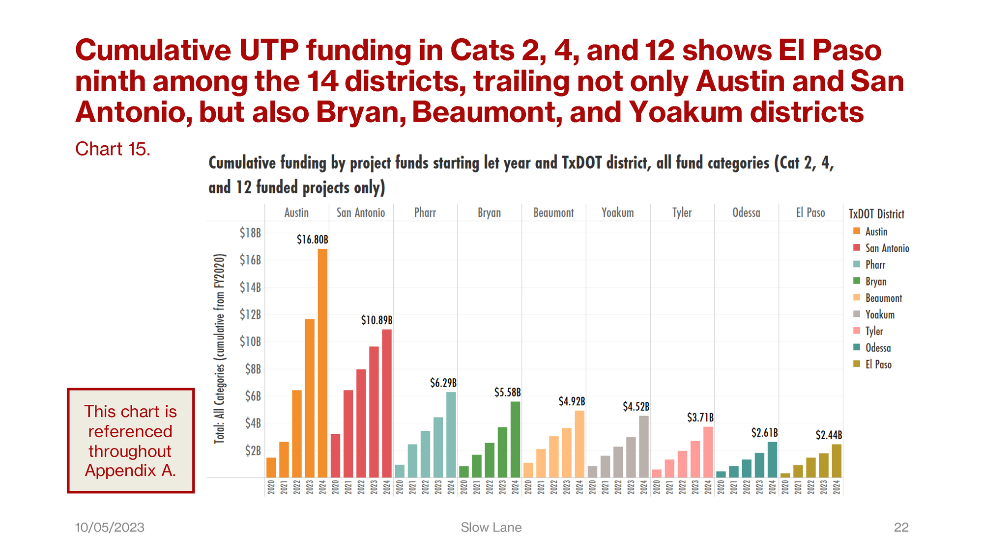
Chart 15, which also appears in the executive summary, is again based on the project fund let dates. This was the best approach for showing the cumulative investment totals over several years, five years as you see here. The eight of the thirteen districts with cumulative total funds greater than El Paso are shown in descending order, with El Paso at the end on the right.
It isn’t surprising to see Austin and San Antonio at the left end of this chart. It is perhaps surprising to see Pharr, Bryan, Beaumont, Yoakum, and Tyler in the middle, even ahead of Odessa.
As the note in the box indicates, this chart is referenced in all the illustrations in Appendix A.
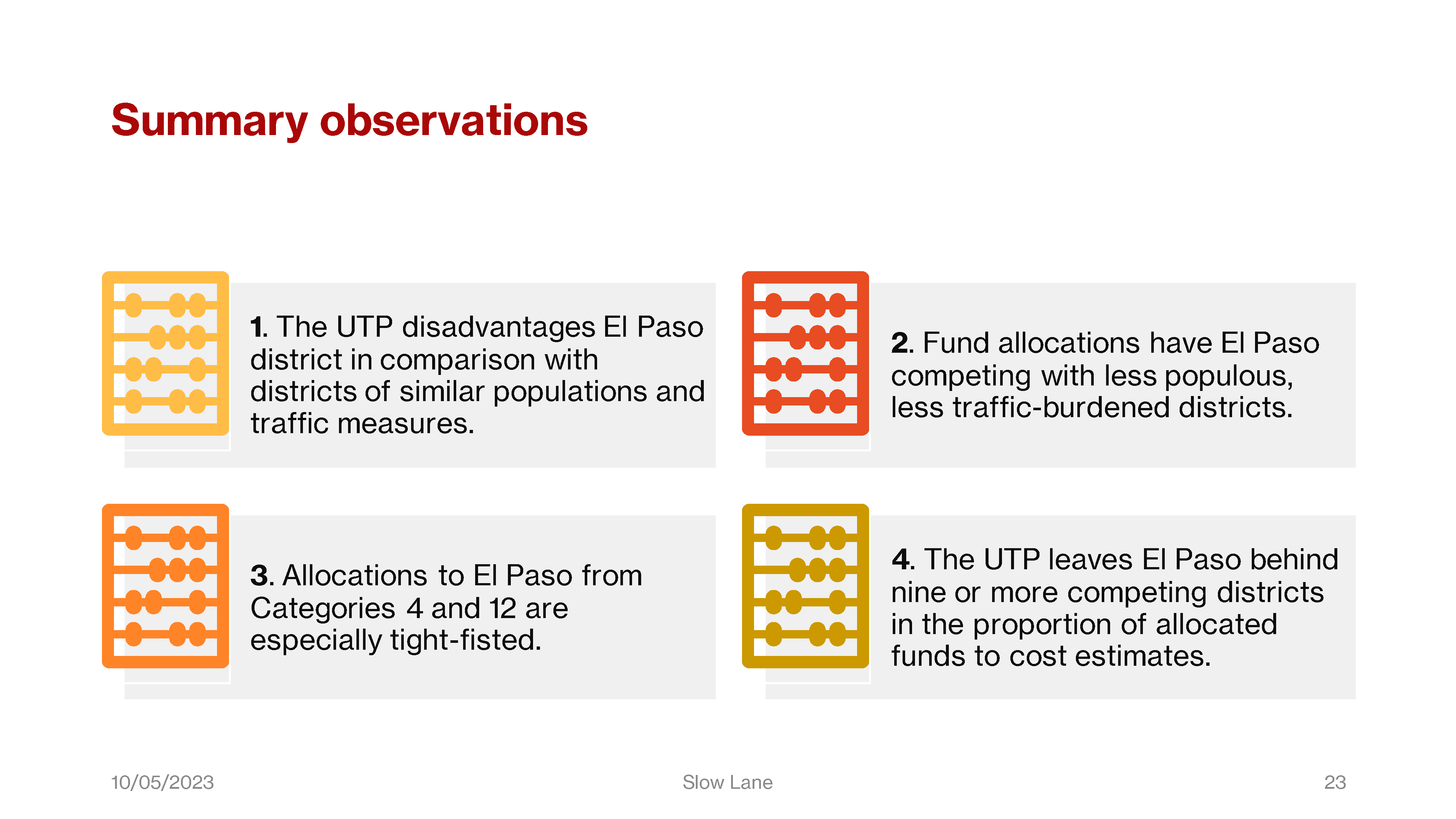
Here we have some summary observations from the foregoing charted data. And this concludes our presentation. Appendices A and B in the full report offer more information for anyone who is seeking more details, for example, on trends in the balances of funds by district compared with El Paso, and other time series observations from FY2017 to FY2024.
